

Psst. Click to enlarge. You never saw me.
Sorry I missed a week, things got crazy between the holidays and the move, and I had exhausted my backup comic the week before. Taking on a 13-panel "Sunday" comic didn't help things. But hey, here it is, and happy 2014! I decided to update the Sunday header for the new year. I'd like to update the blog header as well, but I'm not entirely sure when I'll get around to doing that.
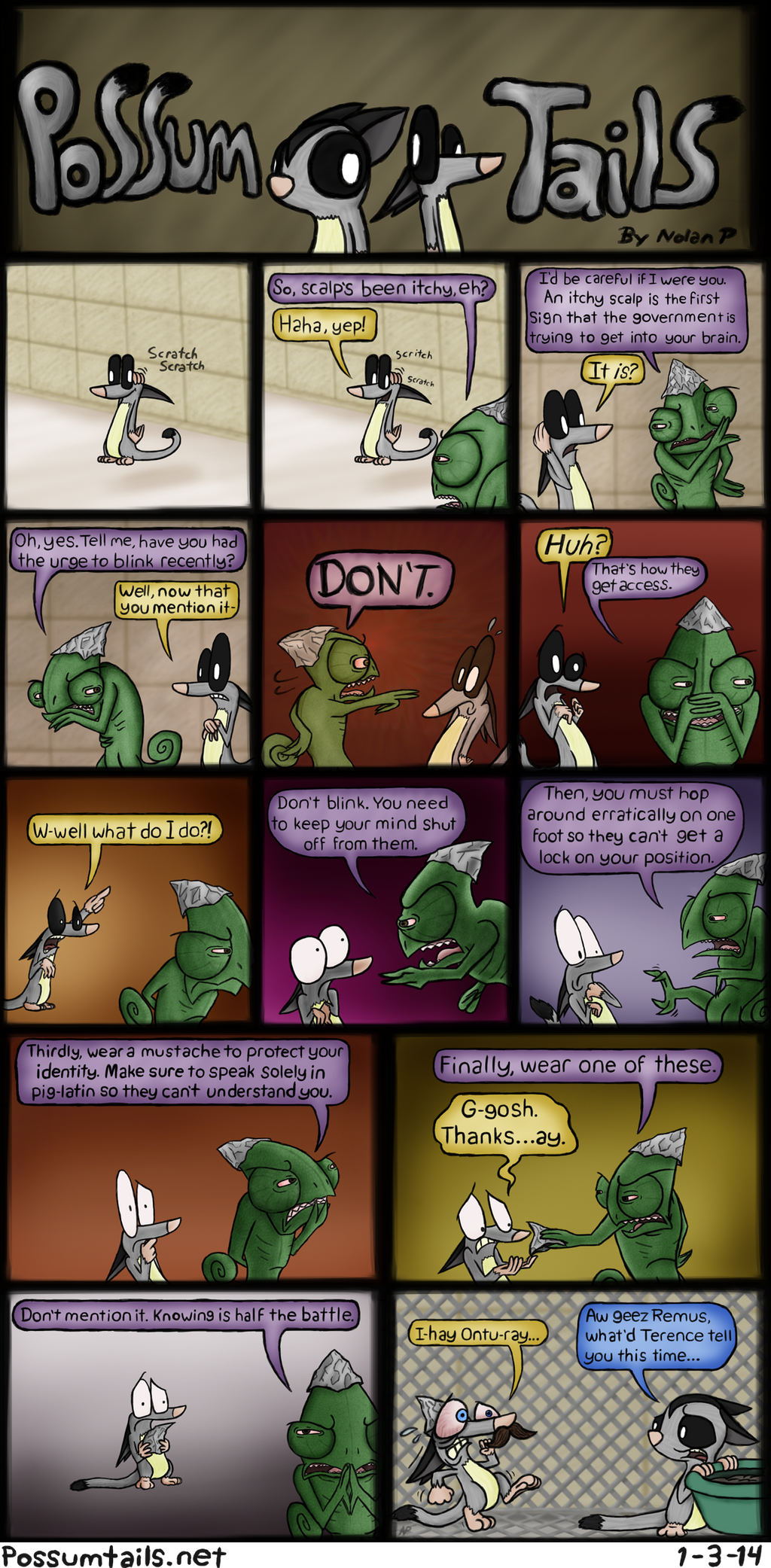
Here we have the debut of Terence the paranoid chameleon. That's another character introduction down. I still have a lot more left to go.
Since I took so long with this comic (and since I promised it on facebook), I'm going to show my work for this comic. Here are the steps I go through making a Possum Tails comic.
First, we have the idea itself, and this typically predates the comic by years, though this particular one harkens back to as recent as last July.

Do that thing I always tell you to do that may or may not involve clicking or enlarging.
All that text in the center is what happens when I first get an idea. I jot it down as quickly as possible to ensure I don't forget it and lose it forever. (Which happens a lot, I have a terrible memory.) The sketches you see crammed above it are from mid-December, when I wanted to start drawing the actual comic. I drew them and arranged them to figure out where the characters should be and when, and how many panels I would need. After that, one more draft was needed to get some stuff worth scanning.

I'd rather not waste all my Click to enlarge gags in one week.
This was another chance to sort out placement, expressions, etc. Things typically come out a lot better when I draw them on paper rather than in Photoshop alone. When I'm all zoomed in and picking at details, I tend to lose sight of the bigger picture, and the result is usually lopsided. A lot of my errors come from last-minute ad-libbing in Photoshop.
After getting my work on the computer by cramming my entire notebook into the scanner and mashing the little button until it did what I wanted, I brought the image up on Photoshop. From there I selected, copied, and pasted the different panels into separate files to work on them individually. The next part stinks. I traced over all pencil lines with my drawing tablet. This part usually takes the longest, and is almost always the most stressful, since there is almost always something I furiously draw, erase, redraw, and re-erase over and over to try and get right. Sometimes the linework goes smooth, sometimes it's a pain. More often than not, the latter.
Now, I did two things different this time through.

First, I used the brush tool instead of the pencil tool, which makes things look a lot smoother. Secondly, I popped plain old text in there as a placeholder to help me figure out how much space the speech balloons were going to take up. I think it was the right way to go, and I'll be doing it again in the future - but maybe not with the same font. This one was too oddly spaced, and when I tried to follow its size closely, the result looked awkward, stretched out, and full of ugly gaps.
The linework is always done with the pencil tool (or brush tool in this case) set to about half opacity, meaning the lines I draw are half translucent. I draw with a sort of sketchy motion and go over the same lines multiple times. This helps me draw curves less jagged and shaky.

(Just realized, you can see my cursor on there next to Remus' nose.)
And the next step was to stuff a background in the layer behind it because yeesh this is ugly.

Ah, that's much better. At this point, I started to cheer up a bit now that what I had in front of me was a little easier on the eyes. Staring at smudgy notebook pages in unusually high-definition for hours starts to get to me after a while.
In some cases, I reuse a background from another comic. Those are good days. This was not one of those days. All the classroom-tile backgrounds I had were either uneven, the wrong shade of color, or not "Sunday"-worthy, so I decided to make a new one. Now that I have it done, it'll save me a lot of time in future comics, which is really nice. This time through, I was challenged with having to make backgrounds for multiple perspectives and camera angles, which I don't know how to do yet. So to chicken out of it, I mean, improvise, I decided to use simple colored backgrounds instead. And I'm glad I did. I feel like the colors really worked in conveying the creepiness and craziness, and made the background a lot more varied than usual.
So now I had a background, but there was still no hand-drawn text, and the lines weren't dark enough for coloring yet. It was time for me to go over ALL of the lines... again. Urgh.

I was having to take frequent breaks at this point to prevent myself from going insane and swearing off drawing forever. (This isn't usually the case. The previous record for time spent on a "Sunday" comic was ten hours, and I had fun the whole way through.) I also darkened the background a bit because mood.
Next up is coloring - the part I always have the most fun with!

I always do coloring in the layer behind the linework. It's usually pretty relaxing when I do it, and it gives me a chance to let my mind wander. I don't use the paint bucket tool - I just scribble it all right in like a coloring book. It's more fun that way. Plus, the paint bucket tool doesn't like it when I use opacity in my linework - it always fills in either too much or not enough, and leaves jagged pixel-y edges. So I just pretend I've got a coloring book filled with my own characters, and go to town on it.
Of course, I'm usually only coloring three or four panels. After the first five, my eyes started drifting in different directions. Much like what Terence can do with his. If this weren't a "Sunday", I'd get to stop here. But what I had in my head involved tons of creepy lighting, detailed(ish) textures, and pretty colored word balloons, so I wasn't done.

Final product, ain't it fancy. I shade things with the burn (darken) and dodge (lighten) tools. It took WAY longer than usual due to all of Terence's doggone scales, but it just wouldn't have looked right if I didn't include them. After that I colored the speech balloons and lightened up their centers, and ta-dah! Finally done. Oh man is that a load off my shoulders. Now to build up a new supply of backup comics and figure out what I'm going to do next week...
(Terence's eyes are uneven there and it's been driving me up the wall for days arrrrgggghhhh why didn't I ever fix it.)
If I sort of meandered on the topics at hand when typing tonight, it's because it's three in the morning and my brain is sort of... shbluh. I wanna go sleep and stuff. So, thanks for tuning in, and provided things go well, see you next week!
- Nolan P.
What version of Photoshop do use?
ReplyDeletePhotoshop Elements 6. I've been using it for years (it came with my drawing tablet), but I still don't know my way around the program too well. There's an insane amount of tools and options in it, and I find it pretty overwhelming, so I usually stick to the familiar. I'm probably making use of only a fraction of a percent of it, and I haven't tried any other versions of it either.
ReplyDelete...I'm honestly kind of ashamed by this.